You are using an out of date browser. It may not display this or other websites correctly.
You should upgrade or use an alternative browser.
You should upgrade or use an alternative browser.
Legacy Tabs Menu ( Nav )
- Status
- Not open for further replies.
This suggestion has been closed. Votes are no longer accepted.
GgAcE
Customer
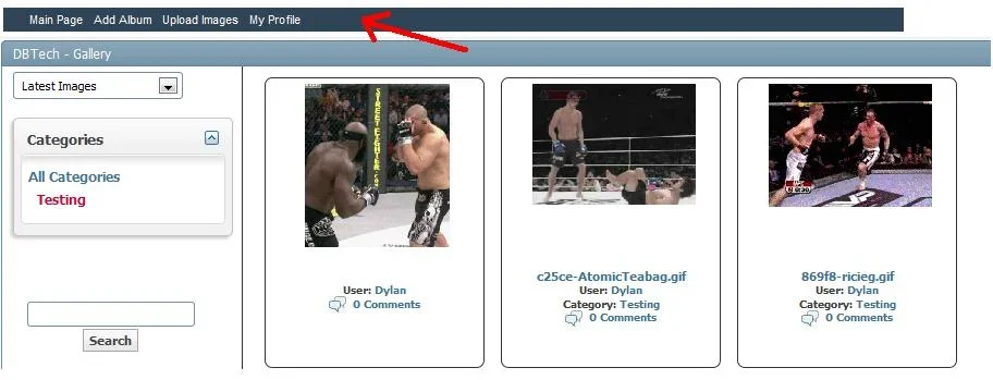
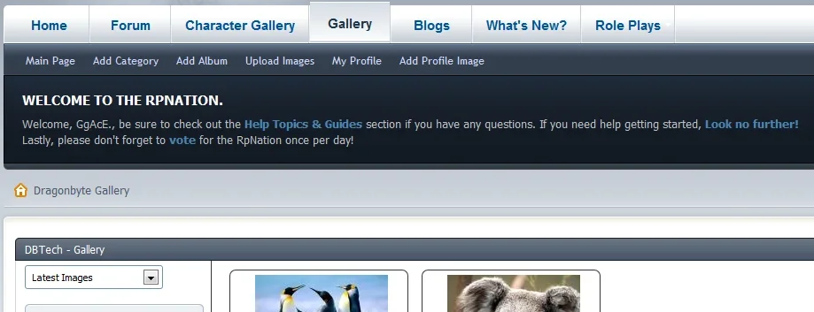
I also agree with this. The current location looks clean but speaking on behalf of my forum skin, there is a large spacer in between. Members who may be new to Vbulletin my not understand how sub-navigation bars work. As suggested above, can we move this or find a cleaner way to bring these options to the users attention such as buttons instead of links, a side bar option, etc.?
- Status
- Not open for further replies.
Similar threads
- Locked
- thread_type.dbtech_ecommerce_suggestion
Legacy
Gallery code customisations
- Replies
- 0
- Views
- 875
- Locked
- thread_type.dbtech_ecommerce_suggestion
- Replies
- 0
- Views
- 1K
- Locked
- thread_type.dbtech_ecommerce_suggestion
Legacy
Gallery Navigation
- Replies
- 0
- Views
- 1K
- Locked
- thread_type.dbtech_ecommerce_suggestion
Legacy
PDF support
- Replies
- 2
- Views
- 3K
- Locked
- thread_type.dbtech_ecommerce_suggestion
- Replies
- 1
- Views
- 2K
Legacy DragonByte Gallery
vBulletin 4.x.x
- Seller
- DragonByte Technologies
- Release date
- Last update
- Total downloads
- 868
- Customer rating
- 0.00 star(s) 0 ratings


