DragonByte Technologies

Company Information
Staff member
Company Info
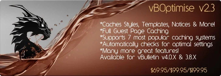
Hey guys, we're planning on putting up images with some basic info on our products on the homepage to help clean things up a little.

Wouldn't mind your thoughts on how they look etc =)

Thanks!

Cosmic
 

Attachments

  • vBOptimise ad.png
    vBOptimise ad.png
    230.7 KB · Views: 1
  • VBA ad.png
    VBA ad.png
    215.3 KB · Views: 0
  • infopanels ad.png
    infopanels ad.png
    221.3 KB · Views: 0
  • vbshoutadtest2.png
    vbshoutadtest2.png
    220.7 KB · Views: 0
  • Mentionmod ad.png
    Mentionmod ad.png
    231.1 KB · Views: 0
I like 'em, but the text doesn't work for me. yeah yeah, I know... it's ALL ABOUT ME. ;)

But my suggestion would be to put a stroke of some sort around the product names to make them pop a little more. Right now, the dragon is popping, which is good, but the names should stand out more (IMO).

The product description also seems a bit... cramped. It's not bad, and if that's the way you like it, it's nothing that would hold back anything. I just think it needs to be a little... something.

Also, the prices aren't aligned with each other. Depending on how they are presented where you want them, it may or may not look right. If all of these are displayed on the same page, then I'd fix the alignment to match each other (like 15 pixels from the right edge or something). If they aren't, then it won't matter much.

Anyway, they look good, don't get me wrong. =)
 
Those are lookin' pretty sweet Cosmic. I personally think the titles look fine, but I would be interessted in seeing the effect a stroke could have.

Otherwise, they look great :]
 
if your going to use a stroke for he titles i suggest making the stroke 1-2px and colored a darker version of the texts color to give it a bit of emphasis, if it looks wrong try maybe replacing the stroke with an outer glow of a ligher/darker shade and see which looks best. the only thing i find bugging me about it is the water looking droplets that are raising up behind the dragon, they look weird and i'm sure if you removed them would tidy the image up :), also the prices should all be right alligned in my opinion and bolded.
 
Oh I just took notice of those water droplets. Yeah I agree with Neo, maybe you could try removing the droplets that go above his nose, or at least set them to the opposite direction 'cuz they're current direction is kinda outta place.
 
Back
Top