You are using an out of date browser. It may not display this or other websites correctly.
You should upgrade or use an alternative browser.
You should upgrade or use an alternative browser.
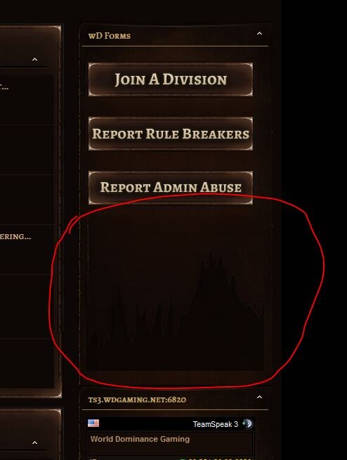
Would Like To Remove The Footer Of Blocks In Side Bar
- Status
- Not open for further replies.
the-danzor
Customer
Can you send me a link to your site? i can then give you the class name and location 
Regards,
Scott
Regards,
Scott
Yes. We are located here: World Dominance Gaming - World DominanceCan you send me a link to your site? i can then give you the class name and location
Regards,
Scott
I should warn you we have a few traditionalist members that are having a hard time with the change... Just ignore the critics. However I would like to get a completely custom theme up one day... I think I will make a pre-sale thread asking for your prices on that if you would like to keep a look out(love what you have posted on deviantart BTW).
the-danzor
Customer
Hello,
Find:
#sidebar_container .underblock
Remove the values and it will remove the bottom of the sidebar. Stylevars may include the same values, otherwise you'll need to edit the css.
Regards,
Scott
Find:
#sidebar_container .underblock
Remove the values and it will remove the bottom of the sidebar. Stylevars may include the same values, otherwise you'll need to edit the css.
Regards,
Scott
Hi Scott,Hello,
Find:
#sidebar_container .underblock
Remove the values and it will remove the bottom of the sidebar. Stylevars may include the same values, otherwise you'll need to edit the css.
Regards,
Scott
I'm having trouble finding some of the values you are giving me(including other post). Would you be able to give me the dicections to get to it? Blanket searching doesnt seem to yield results.
For example, I can find "sidebar_container" in a few CSS's but I cant find "underblock". Thanks.
the-danzor
Customer
Can you PM me AdminCP Access? i can locate it and do the fixes personally for you.
Regards,
Scott
Regards,
Scott
Just sent it over. Thank you.Can you PM me AdminCP Access? i can locate it and do the fixes personally for you.
Regards,
Scott
Updated permissions no that account I sent, Let me know if your having troubles. Thank you.Can you PM me AdminCP Access? i can locate it and do the fixes personally for you.
Regards,
Scott
the-danzor
Customer
Updated permissions no that account I sent, Let me know if your having troubles. Thank you.
Still don't have access to the styles and templates tab.
Regards,
Scott
Im sorry Scott... I completely forgot to set up Usergroups -> Administrator Permissions for that account.Still don't have access to the styles and templates tab.
Regards,
Scott
the-danzor
Customer
Im sorry Scott... I completely forgot to set up Usergroups -> Administrator Permissions for that account.Give it a try now.
Changes were applied for you.
I added a margin to the theme width and removed the bottom part of the sidebars.
Regards,
Scott
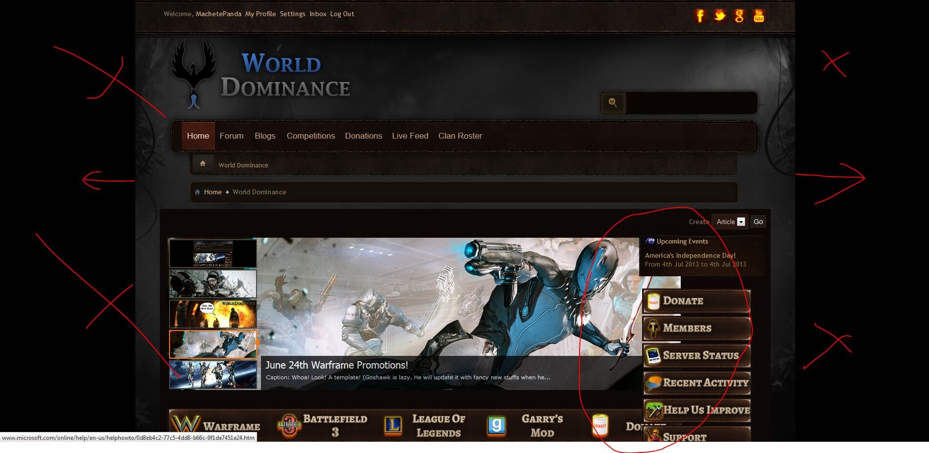
Hi Scott, Thank you but new problem.... For the theme width we want the background to be 100 of the browser and we need the content to be 1350. See attached image:Changes were applied for you.
I added a margin to the theme width and removed the bottom part of the sidebars.
Regards,
Scott

As you can see in the above image on the home page our slider is now being forced under the navigation bars on the right(see circled) and the background image still isnt full width of the browser like what you have on the preview: http://www.dragonbyte-tech.com/screenshots/182/152.png
Let me know which values I need to change and where they are located to fix this. Thank you.
the-danzor
Customer
Hi Scott, Thank you but new problem.... For the theme width we want the background to be 100 of the browser and we need the content to be 1350. See attached image:
View attachment 4562
As you can see in the above image on the home page our slider is now being forced under the navigation bars on the right(see circled) and the background image still isnt full width of the browser like what you have on the preview: http://www.dragonbyte-tech.com/screenshots/182/152.png
Let me know which values I need to change and where they are located to fix this. Thank you.
That required resolutions will break a lot of peoples resolutions, as well make mobile support very hard. So i caution you on having a required width of 1300px.
The cause of the Background cutting is because you added a width to the body tag.
body {
color: #8F7E6D ;
font: 14px helvetica,arial,sans-serif;
margin: auto;
max-width: 1450px;
min-width: 1450px;
overflow-x: hidden;
width: 100%;
}
change too:
body {
color: #8F7E6D ;
font: 14px helvetica,arial,sans-serif;
padding:0px;
margin:0px;
}
If you did this VIA stylevars you need to edit the stylevars, otherwise edit the CSS you made the edits too.
Regards,
Scott
Hello, I understand your concern but we decided on a more "wide screen" width from a little research I will share with you. Over 90% of the web surfing population run on 1024px width or greater in 2012 with the most popular being 1366px that year(Geek.com). It works great for the existing community and being a European and North American site focused on gaming, we figured our prospect audience will also be on the high end of that.That required resolutions will break a lot of peoples resolutions, as well make mobile support very hard. So i caution you on having a required width of 1300px.
The cause of the Background cutting is because you added a width to the body tag.
body {
color: #8F7E6D ;
font: 14px helvetica,arial,sans-serif;
margin: auto;
max-width: 1450px;
min-width: 1450px;
overflow-x: hidden;
width: 100%;
}
change too:
body {
color: #8F7E6D ;
font: 14px helvetica,arial,sans-serif;
padding:0px;
margin:0px;
}
If you did this VIA stylevars you need to edit the stylevars, otherwise edit the CSS you made the edits too.
Regards,
Scott
It's interesting because while we have been working with you on the whole "black bar" on the sides problem, we received numerous complaints about the black bar further solidifying our decision.
Getting back to your above mentioned solution, I couldn't find any of that, and we also hadn't changed any of that in the first place so that solution didn't work for us. But we were able to finally reverse engineer the problem after a few days of fiddling, and we came up with this solution:
Which seems to be working.Style Manager > Style Variable Editor (go) > filter word doc_
Go to doc_maxwidth, and doc_minwidth and clear their fields hitting save. In doc_width switch to 100% hitting save.
Style Manager > Template Options (pull down) > Edit Templates (Go) > CSS Templates (expand) > additional.css (edit)
Add to the top the following:
.body_wrapper { margin: 0 auto; width: 1350px;}
.breadcrumb { margin: 0 auto; width: 1350px;}
.nav_area { margin: 0 auto; width: 1350px;}
.header { margin: 0 auto; width: 1350px;}
.doc_header { margin: 0 auto; width: 1350px;}
(change the "width:" sections to your desired width, then save.
Do you see any future problems with this solution?
Thank you again.
the-danzor
Customer
Hello, I understand your concern but we decided on a more "wide screen" width from a little research I will share with you. Over 90% of the web surfing population run on 1024px width or greater in 2012 with the most popular being 1366px that year(Geek.com). It works great for the existing community and being a European and North American site focused on gaming, we figured our prospect audience will also be on the high end of that.
It's interesting because while we have been working with you on the whole "black bar" on the sides problem, we received numerous complaints about the black bar further solidifying our decision.
Getting back to your above mentioned solution, I couldn't find any of that, and we also hadn't changed any of that in the first place so that solution didn't work for us. But we were able to finally reverse engineer the problem after a few days of fiddling, and we came up with this solution:Which seems to be working.
Do you see any future problems with this solution?
Thank you again.
Hello,
There is a few issues with this approach.
The theme was designed to have it's width set MUCH easier then this. Your editing a lot of values which doesn't need to be edited and as a result causing issues.
Body, html i never assign a width to, so somewhere during the editing process someone added this to the body tag. Causing the background issue you mentioned above.
In order to change the width, all you needed to do is follow the instructions attached with the theme on how to edit the width. Then set the width to 1350px. Only one class and value needed to be added, the rest of the theme will auto adjust without background cropping and other issues.
additional.css has a width class in it (#skin_width), by default. Editing that one class will adjust the rest of the theme width with no issue. Atm you're making things a lot more complicated (editing a lot of sections) and such modifications does make the theme harder for me to support & patch.
Altering a lot of the themes code or setup does remove the free support if a lot of issues come up from it. Keep that in mind
Regards,
Scott
Last edited:
Im still having a hard time finding it. I am missing the "Template Name" option from my "Styles & Templates". I'm following the directions each time as it suggests, AdminCP > Styles & Templates > Template Name. But it is not there.Hello,
There is a few issues with this approach.
The theme was designed to have it's width set MUCH easier then this. Your editing a lot of values which doesn't need to be edited and as a result causing issues.
Body, html i never assign a width to, so somewhere during the editing process someone added this to the body tag. Causing the background issue you mentioned above.
In order to change the width, all you needed to do is follow the instructions attached with the theme on how to edit the width. Then set the width to 1350px. Only one class and value needed to be added, the rest of the theme will auto adjust without background cropping and other issues.
additional.css has a width class in it (#skin_width), by default. Editing that one class will adjust the rest of the theme width with no issue. Atm you're making things a lot more complicated (editing a lot of sections) and such modifications does make the theme harder for me to support & patch.
Altering a lot of the themes code or setup does remove the free support if a lot of issues come up from it. Keep that in mind
Regards,
Scott
Did something not load? Should I run one of the XML files again?
the-danzor
Customer
Im still having a hard time finding it. I am missing the "Template Name" option from my "Styles & Templates". I'm following the directions each time as it suggests, AdminCP > Styles & Templates > Template Name. But it is not there.
Did something not load? Should I run one of the XML files again?
Template Name# is the name of the template / theme you would like to edit. Everyone names the template from it's orginal name "Dragonbyte Mmo" to their website or brand name. As a result the Template Name # is used to indicate to the user, to choose the theme you would like to edit.
Move purely to the edit templates > css templates > additional.css and follow the steps
Regards,
Scott
I see now. Awesome Scott. Got it! Thank you for all the help! This theme looks sexy now!Template Name# is the name of the template / theme you would like to edit. Everyone names the template from it's orginal name "Dragonbyte Mmo" to their website or brand name. As a result the Template Name # is used to indicate to the user, to choose the theme you would like to edit.
Move purely to the edit templates > css templates > additional.css and follow the steps
Regards,
Scott
- Status
- Not open for further replies.
Similar threads
- Locked
- Support ticket
- Replies
- 6
- Views
- 1K
- Locked
- Support ticket
- Replies
- 13
- Views
- 2K
- Locked
- Support ticket
- Replies
- 5
- Views
- 1K
- Locked
- Support ticket
Question
Problem with placement of sub nav
- Replies
- 4
- Views
- 1K
- Locked
- Support ticket
- Replies
- 1
- Views
- 546
Legacy DragonByte MMO
vBulletin 4.1.x
vBulletin 4.2.x
- Seller
- DragonByte Technologies
- Release date
- Last update
- Total downloads
- 151
- Customer rating
- 0.00 star(s) 0 ratings

