Status
Not open for further replies.

MainFrame

Customer
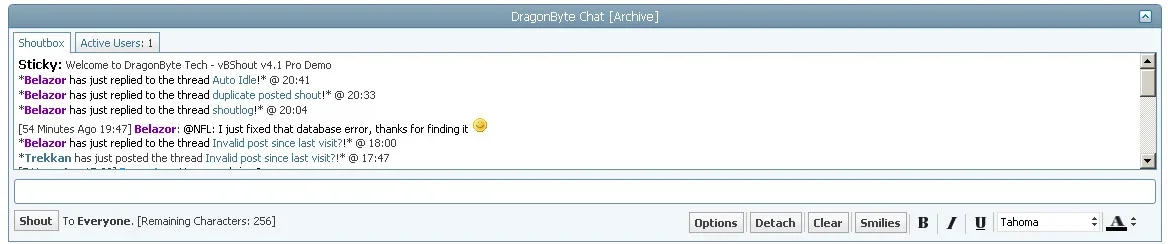
Here's a screenshot I photoshopped, I've used infernoshout for years and when I did I restyled it to look pretty much as the my attached image. I think it look much better that way.
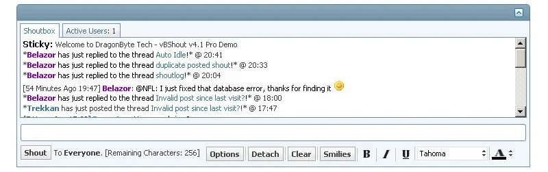
Added a 1px border around the shoutbox, moved the collapse icon so that it's centered and moved the input options to the bottom. All can be easely done using css.

Regards,
MainFrame
 

Attachments

  • Untitled-2..jpg
    Untitled-2..jpg
    90.1 KB · Views: 18
Last edited:
I concur, however with design we like to keep those with smaller resolutions happy. Sometimes it makes design a little tricky and we have to abandon ideas, but we're always working to improve things :)
 
It could work (even for 800x600) if I removed the Options and Detach buttons, and instead made them part of a dropdown menu.
The Smilies button has already been replaced with a smilie graphic in the latest bugfix version which is due for release very soon.

I'll look into it when I have some free time, thanks :D
 
Here's an image of 800px width, this is how the shoutbox would look like on a resolution of 800x600.
don't think there will be much people having a lower resolution than 800x600 and if they do they are used to sites that don't fit the screen horizontally.

Regards,
MainFrame
 

Attachments

  • 800..jpg
    800..jpg
    80.2 KB · Views: 9
I like this as well. =)

One option you also have is to make the detach and clear buttons, icons instead. Which should reduce a lot of space too.
 
I like the idea of a graphical smiley just like the wysiwyg interface :-)

I also have another little suggestion which I used my own shoutbox.
I've used the images statusicon/user-online.png, user-offline.png and user-invisible.png to indicate the status of the shoutbox which gave an nice effect.

user-online..png for when the user was active but the shoutbox was not loading.
user-invisible..png for when the shoutbox was loading (retrieving or posting shout)
user-offline..png for when the shoutbox was idle.

Here's an old screenshot of my shoutbox, don't use it anymore now I have yours but when you look in the titlebar you'll see the location of the user-offline..pngicon. That's were the status was blinking.

firefox...jpg

Regards,
MainFrame
 
We plan on restructuring the SB a bit for the next major version, there's going to be some pretty significant changes to the layout (Things like displaying who's active in the SB etc)

Essentially i plan on making an additional info column in the shoutbox, so we'll see how that affects layout etc before we go promising anything =)
 
Here's an image of 800px width, this is how the shoutbox would look like on a resolution of 800x600.
don't think there will be much people having a lower resolution than 800x600 and if they do they are used to sites that don't fit the screen horizontally.

Regards,
MainFrame
I managed to get the tabs looking like that, I'd hardly call it easy CSS though ;)
It's not going to be a part of the upcoming bugfix release though, maybe another minor version in between that and 4.2 :)

I'd like to get some testing done on a dark skin also before pushing it, I think it's going to look kinda funky on such skins. Or maybe it'll look better. Who knows? xD
 
I understand your issues with css, I'm dealing with those myself and don't like it :p
I created a filesharing system on my site and needed to port it to vbulletin 4, decided to just go with a table layout because I just don't get things to work with css or even if you get it working in firefox, the results might not what you expect in IE :(

Perhaps it would be best to add an option to reverse the colors for dark layouts.

Regards,
MainFrame
 
Status
Not open for further replies.
Top