Implemented CSS Rating Circle Widget

Status
Not open for further replies.

Nulumia

Customer
Just built this in for my new site, basically a pretty CSS circle loader which pulls rating info via templates.

rating-circle-loader.jpg

Not 100% a Feature Request, but if you would ever be interested in adding a widget or something like this, I'd be happy to share how I did it :)

Basically I added in a new macro within rating_macros called rating_circle, with a rating_circle.less template for CSS.
 

Attachments

  • rating-circle-loader2.jpg
    rating-circle-loader2.jpg
    69 KB · Views: 2
Upvote 0
This suggestion has been implemented. Votes are no longer accepted.
Hello @Nulumia,

Thank you for your suggestion for DragonByte eCommerce. Your request will be reviewed by a member of our team shortly.

Unless there are any problems preventing these features from being added to the product, this thread will not receive another reply until it is time to review logged feature requests for implementation.

We appreciate you taking the time to help us improve our products!


- DragonByte Tech Staff
 
Sure, if you want to share it I can look into making it an option, probably a StyleVar so it can be toggled per style :)

Thanks!
 
Just checking in to see if there's any updates on this as I'd want to include it in the 1.2.0 update :)

Thanks!
 
Either way is fine, I don't think there's any sensitive data in that area so whichever you prefer is fine by me :)
 
Hi Fillip, broken up as to not exceed char limit:

Step 1:

You will likely use template modifications to do this for your addon. In rating_macros, insert the following macro between <xf:macro name="stars_text"... and <xf:macro name="setup">:

Code:
<xf:macro name="stars_circle" arg-rating="!" arg-class="">
    <xf:css src="rating_circle.less" />
  
    <div class="rating-circle rating-{{ {$rating|number(1)} * 20 }} {{ $rating >= 2.5 ? ' overHalf' : '' }}">
       <div class="ratingCircleRow">
           <div class="ratingCircleRow-inner">
               <h3 class="ratingPercent">{{ {$rating|number(2)} * 20 }}%</h3>
               <a href="reviews" class="ratingLink">Read the reviews!</a>
               <span class="ratingStars {$class}" title="{{ phrase('x_stars', {'rating': $rating|number(2)})|for_attr }}">
                   <span class="ratingStars-star{{ $rating >= 1 ? ' ratingStars-star--full' : '' }}{{ ($rating >= 0.5 AND $rating < 1) ? ' ratingStars-star--half' : '' }}"></span>
                   <span class="ratingStars-star{{ $rating >= 2 ? ' ratingStars-star--full' : '' }}{{ ($rating >= 1.5 AND $rating < 2) ? ' ratingStars-star--half' : '' }}"></span>
                   <span class="ratingStars-star{{ $rating >= 3 ? ' ratingStars-star--full' : '' }}{{ ($rating >= 2.5 AND $rating < 3) ? ' ratingStars-star--half' : '' }}"></span>
                   <span class="ratingStars-star{{ $rating >= 4 ? ' ratingStars-star--full' : '' }}{{ ($rating >= 3.5 AND $rating < 4) ? ' ratingStars-star--half' : '' }}"></span>
                   <span class="ratingStars-star{{ $rating >= 5 ? ' ratingStars-star--full' : '' }}{{ ($rating >= 4.5 AND $rating < 5) ? ' ratingStars-star--half' : '' }}"></span>
                   <span class="u-srOnly">{{ phrase('x_stars', {'rating': $rating|number(2)}) }}</span>
               </span>
           </div>
        </div>
        <div class="leftCover">
            <div class="initialBar"></div>
            <div class="valueBar"></div>
        </div>
    </div>
</xf:macro>

I have done my best here to use traditional XF2 class syntax.
You'll want to probably use phrases and vars for:
<a href="reviews" class="ratingLink">Read the reviews!</a>
 
Last edited:
Step 2:

Create a rating_circle.less template, and insert the following:

Code:
/* Set initial vars */
@_circleWidth: @xf-nlRatingCircleWidth;
@_halfWidth: (@xf-nlRatingCircleWidth) * .5;
@_barWidth: @xf-nlRatingCircleBarWidth;
@_offset: (@_barWidth) * 2;
@_trackColor: @xf-nlRatingCircleTrackColor;
@_barColor: @xf-nlRatingCircleBarColor;
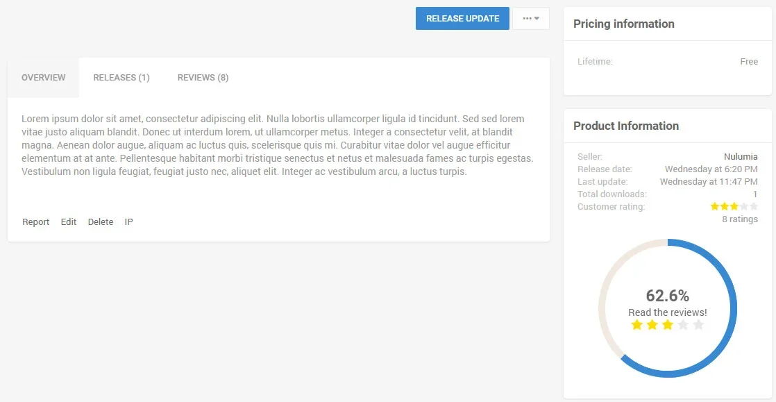
.rating-circle {
    font-size: @xf-fontSizeLarge;
    margin: @xf-elementSpacer auto;
    background-color: @_trackColor;
    position: relative;
    width: @_circleWidth;
    height: @_circleWidth;
    line-height: @_circleWidth;
    border-radius: 50%;
  
    &:after {
        content: " ";
        position: absolute;
        top: @_barWidth;
        left: @_barWidth;
        border: none;
        background-color: @xf-contentBg; /* Should matche bg of block container */
        text-align: center;
        display: block;
        width: (@_circleWidth - @_offset);
        height: (@_circleWidth - @_offset);
        border-radius: 50%;
    }
    .ratingCircleRow {
        position: absolute;
        width: 100%;
        text-align: center;
        z-index: 20;
        display: flex;
        height: 200px;
        align-items: center;
        justify-items: center;
    }
    .ratingCircleRow-inner {
        display: flex;
        flex-direction: column;
        width: 90%;
        line-height: initial;
        height: auto;
        margin: auto;
        flex: 1;
      
        /* Resets from default alignment */
        .ratingStars-star {
            float: none;
        }
        h3.ratingPercent {
            font-size: @xf-fontSizeLarger;
        }
        /* Optional - styles the link to reviews */
        a.ratingLink {
          
        }
    }
    .leftCover {
        position: absolute;
        width: @_circleWidth;
        height: @_circleWidth;
        clip: rect(0, @_circleWidth, @_circleWidth, @_halfWidth);
        border-radius: 50%;
    }
    &.overHalf .initialBar {
        position: absolute;
        background-color: @_barColor;
        width: @_circleWidth;
        height: @_circleWidth;
        clip: rect(0, @_circleWidth, @_circleWidth, @_halfWidth);
        border-radius: 50%;
    }
    &:not(.overHalf) .initialBar {
        display: none;
    }
    &.overHalf .leftCover {
        clip: rect(auto,auto,auto,auto);
    }
    .valueBar {
        position: absolute;
        width: @_circleWidth;
        height: @_circleWidth;
        border: @_barWidth solid @_barColor;
        clip: rect(0, @_halfWidth, @_circleWidth, 0);
        border-radius: 50%;
    }
    .rating-0 .valueBar {
        display: none;
    }
}

/* Set ratings */
.rating-0 .valueBar { display: none; }
.rating-1 .valueBar { transform: rotate(4deg); }
.rating-2 .valueBar { transform: rotate(7deg); }
.rating-3 .valueBar { transform: rotate(11deg); }
.rating-4 .valueBar { transform: rotate(14deg); }
.rating-5 .valueBar { transform: rotate(18deg); }
.rating-6 .valueBar { transform: rotate(22deg); }
.rating-7 .valueBar { transform: rotate(25deg); }
.rating-8 .valueBar { transform: rotate(29deg); }
.rating-9 .valueBar { transform: rotate(32deg); }
.rating-10 .valueBar { transform: rotate(36deg); }
.rating-11 .valueBar { transform: rotate(40deg); }
.rating-12 .valueBar { transform: rotate(43deg); }
.rating-13 .valueBar { transform: rotate(47deg); }
.rating-14 .valueBar { transform: rotate(50deg); }
.rating-15 .valueBar { transform: rotate(54deg); }
.rating-16 .valueBar { transform: rotate(58deg); }
.rating-17 .valueBar { transform: rotate(61deg); }
.rating-18 .valueBar { transform: rotate(65deg); }
.rating-19 .valueBar { transform: rotate(68deg); }
.rating-20 .valueBar { transform: rotate(72deg); }
.rating-21 .valueBar { transform: rotate(76deg); }
.rating-22 .valueBar { transform: rotate(79deg); }
.rating-23 .valueBar { transform: rotate(83deg); }
.rating-24 .valueBar { transform: rotate(86deg); }
.rating-25 .valueBar { transform: rotate(90deg); }
.rating-26 .valueBar { transform: rotate(94deg); }
.rating-27 .valueBar { transform: rotate(97deg); }
.rating-28 .valueBar { transform: rotate(101deg); }
.rating-29 .valueBar { transform: rotate(104deg); }
.rating-30 .valueBar { transform: rotate(108deg); }
.rating-31 .valueBar { transform: rotate(112deg); }
.rating-32 .valueBar { transform: rotate(115deg); }
.rating-33 .valueBar { transform: rotate(119deg); }
.rating-34 .valueBar { transform: rotate(122deg); }
.rating-35 .valueBar { transform: rotate(126deg); }
.rating-36 .valueBar { transform: rotate(130deg); }
.rating-37 .valueBar { transform: rotate(133deg); }
.rating-38 .valueBar { transform: rotate(137deg); }
.rating-39 .valueBar { transform: rotate(140deg); }
.rating-40 .valueBar { transform: rotate(144deg); }
.rating-41 .valueBar { transform: rotate(148deg); }
.rating-42 .valueBar { transform: rotate(151deg); }
.rating-43 .valueBar { transform: rotate(155deg); }
.rating-44 .valueBar { transform: rotate(158deg); }
.rating-45 .valueBar { transform: rotate(162deg); }
.rating-46 .valueBar { transform: rotate(166deg); }
.rating-47 .valueBar { transform: rotate(169deg); }
.rating-48 .valueBar { transform: rotate(173deg); }
.rating-49 .valueBar { transform: rotate(176deg); }
.rating-50 .valueBar { transform: rotate(180deg); }
.rating-51 .valueBar { transform: rotate(184deg); }
.rating-52 .valueBar { transform: rotate(187deg); }
.rating-53 .valueBar { transform: rotate(191deg); }
.rating-54 .valueBar { transform: rotate(194deg); }
.rating-55 .valueBar { transform: rotate(198deg); }
.rating-56 .valueBar { transform: rotate(202deg); }
.rating-57 .valueBar { transform: rotate(205deg); }
.rating-58 .valueBar { transform: rotate(209deg); }
.rating-59 .valueBar { transform: rotate(212deg); }
.rating-60 .valueBar { transform: rotate(216deg); }
.rating-61 .valueBar { transform: rotate(220deg); }
.rating-62 .valueBar { transform: rotate(223deg); }
.rating-63 .valueBar { transform: rotate(227deg); }
.rating-64 .valueBar { transform: rotate(230deg); }
.rating-65 .valueBar { transform: rotate(234deg); }
.rating-66 .valueBar { transform: rotate(238deg); }
.rating-67 .valueBar { transform: rotate(241deg); }
.rating-68 .valueBar { transform: rotate(245deg); }
.rating-69 .valueBar { transform: rotate(248deg); }
.rating-70 .valueBar { transform: rotate(252deg); }
.rating-71 .valueBar { transform: rotate(256deg); }
.rating-72 .valueBar { transform: rotate(259deg); }
.rating-73 .valueBar { transform: rotate(263deg); }
.rating-74 .valueBar { transform: rotate(266deg); }
.rating-75 .valueBar { transform: rotate(270deg); }
.rating-76 .valueBar { transform: rotate(274deg); }
.rating-77 .valueBar { transform: rotate(277deg); }
.rating-78 .valueBar { transform: rotate(281deg); }
.rating-79 .valueBar { transform: rotate(284deg); }
.rating-80 .valueBar { transform: rotate(288deg); }
.rating-81 .valueBar { transform: rotate(292deg); }
.rating-82 .valueBar { transform: rotate(295deg); }
.rating-83 .valueBar { transform: rotate(299deg); }
.rating-84 .valueBar { transform: rotate(302deg); }
.rating-85 .valueBar { transform: rotate(306deg); }
.rating-86 .valueBar { transform: rotate(310deg); }
.rating-87 .valueBar { transform: rotate(313deg); }
.rating-88 .valueBar { transform: rotate(317deg); }
.rating-89 .valueBar { transform: rotate(320deg); }
.rating-90 .valueBar { transform: rotate(324deg); }
.rating-91 .valueBar { transform: rotate(328deg); }
.rating-92 .valueBar { transform: rotate(331deg); }
.rating-93 .valueBar { transform: rotate(335deg); }
.rating-94 .valueBar { transform: rotate(338deg); }
.rating-95 .valueBar { transform: rotate(342deg); }
.rating-96 .valueBar { transform: rotate(346deg); }
.rating-97 .valueBar { transform: rotate(349deg); }
.rating-98 .valueBar { transform: rotate(353deg); }
.rating-99 .valueBar { transform: rotate(356deg); }
.rating-100 .valueBar { transform: rotate(360deg); }
 
Step 3:

The circle loader needs a specified width to display correctly, either in pixel or em. Since even on the smallest screens I doubt the sidebar would ever scale that low, I used 200px for my default value.

You can set hard values for the vars at the top, but as you can see I linked them to style properties to customize the loader:

rating-circle-properties.jpg

Obviously you would use your own property naming scheme and just need to change the @vars at the top of the less template.
 
Step 4:

Personally, I placed the loader right below the Product Information dl-pairs rows within dbtech_ecommerce_product_wrapper, but you can easily place this elsewhere or wrap it in a widget.

My placement:
Code:
                <xf:if is="$xf.options.dbtechEcommerceEnableRate">
                    <dl class="pairs pairs--justified"><dt>{{ phrase('dbtech_ecommerce_customer_rating') }}</dt> <dd>
                        <xf:macro template="rating_macros" name="stars_text"
                                  arg-rating="{$product.rating_avg}"
                                  arg-count="{$product.rating_count}"
                                  arg-rowClass="ratingStarsRow--textBlock"
                                  arg-starsClass="ratingStars--smaller" />
                    </dd></dl>
                
                    <xf:macro template="rating_macros" name="stars_circle"
                                  arg-rating="{$product.rating_avg}"
                                  arg-count="{$product.rating_count}" />
                
                </xf:if>

The snippet itself is just:
Code:
<xf:macro template="rating_macros" name="stars_circle"
          arg-rating="{$product.rating_avg}"
          arg-count="{$product.rating_count}" />

Hope this ends up working on your end! I have tons of ideas/suggestions still.. trying not to bombard you though :D. Feel free to change all the code to your needs.
 
I'm done with the implementation and my changes now, thanks :)

Notable changes:
  • A new style property for choosing circle or stars has been added
  • The original "Customer rating" block does not display when the style uses the Circle
  • The position of the circle is below the custom fields macro call
  • Instead of using template modifications to insert the new macro into the existing template, I created a new macro template
  • Inside the rating circle macro, I refer back to the original rating stars macro instead of hard-coding the HTML for the stars
  • Instead of just displaying the stars, I also display the rating count beneath the stars (referring to the stars_text macro) because of the removal of the original "Customer rating" info row
  • Because I want this macro to be dynamic, I don't add $product as an argument, so the "Read the reviews" link has been removed
  • The default style has heavy margins on <h3> tags, so this has been transformed into a <span>
  • Rather than making the circle width customisable, it's calculated based on the sidebar width like so: (@xf-sidebarWidth - (@xf-sidebarSpacer * 2)) - This fits perfectly with the existing information rows :)
  • Rather than hardcoding 100 rating bar widths, it's calculated using LESS like so:
    Less:
    /* Set ratings */
    .generate-ratings(100);
    
    .generate-ratings(@n, @i: 1) when (@i =< @n) {
        .rating-@{i} {
            .valueBar {
                transform: rotate(ceil((@i * 360deg / @n)));
            }
        }
        .generate-ratings(@n, (@i + 1));
    }
Result:

1541108484118.png

Of course, you can re-add the reviews link in your own customisation :)

I have tons of ideas/suggestions still
Now is definitely the time to post feature requests, after v1.2.0 is released I'll be going back to work on the Security mod rewrite so my time will be spread more thin :)
 
Wow Fillip, that's really awesome how you were able to enhance and rework the feature (y). I really like your clever i/when clause, admittedly I'm still a .LESS beginner so didn't know you could do that!

Now is definitely the time to post feature requests, after v1.2.0 is released I'll be going back to work on the Security mod rewrite so my time will be spread more thin :)

Thanks for the heads up! Do you think after your Security mod work, are there still other major projects in line or would you be able to continue more features for Ecommerce?
 
I’ll always be working on eCommerce, what I meant was that I prefer to finish working on each update before looking at other feature requests :)
 
Hello @Nulumia,

We hope your ticket regarding DragonByte eCommerce has been addressed to your satisfaction. This ticket has now been closed.

If your ticket has not been resolved, you can reply to this thread at any point in the next 7 days in order to reopen the ticket, afterwards this thread will be closed.

Please do not reply to this thread if your ticket has been resolved.

Thank you.


- DragonByte Technologies, Ltd.
 
Status
Not open for further replies.
Back
Top