You are using an out of date browser. It may not display this or other websites correctly.
You should upgrade or use an alternative browser.
You should upgrade or use an alternative browser.
Question Create/Start discussion - Also needs to be on the root page
- Thread starter l3gacy
- Start date
-
- Tags
- start discussion
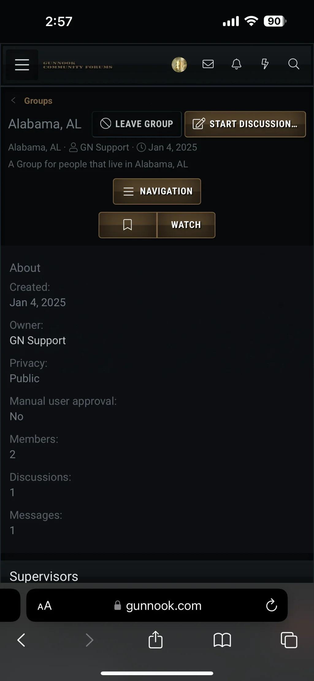
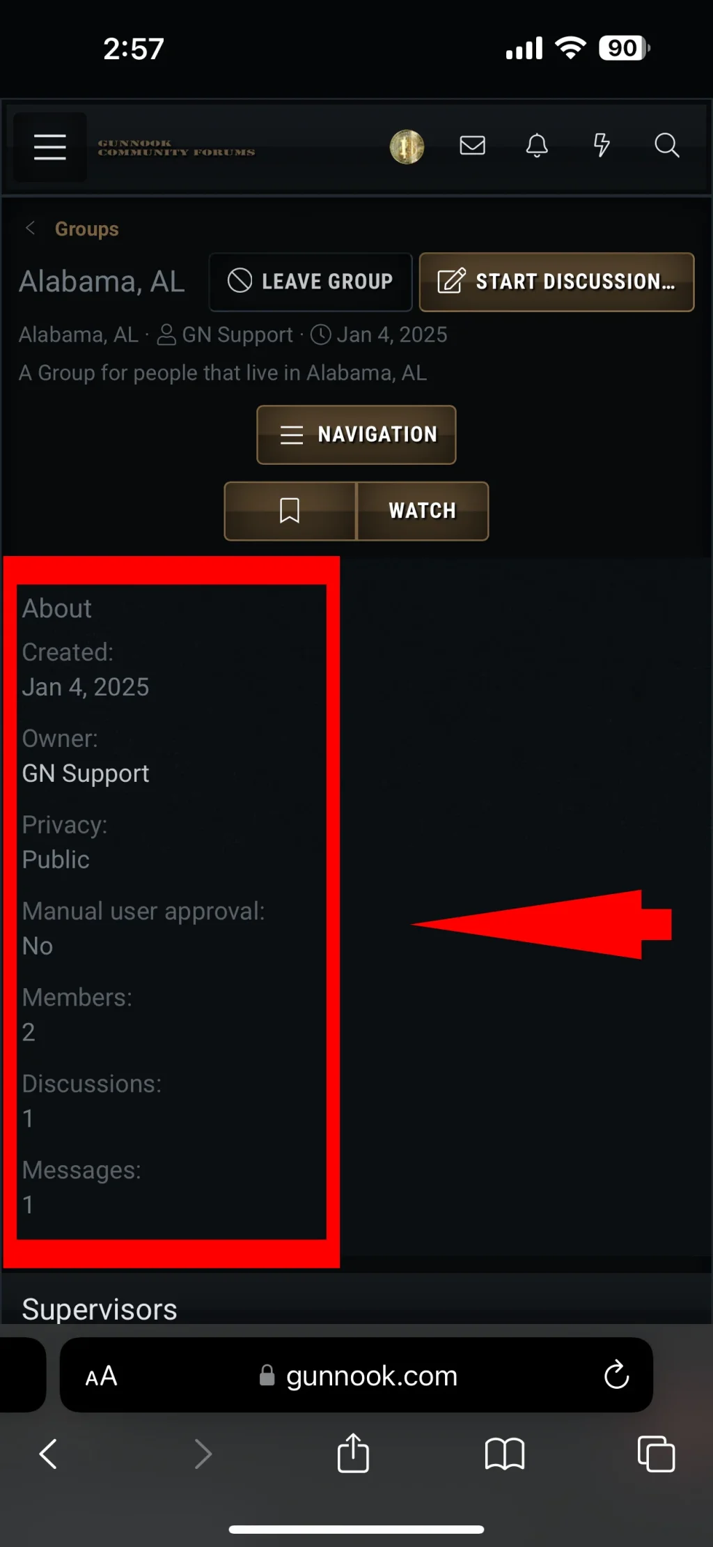
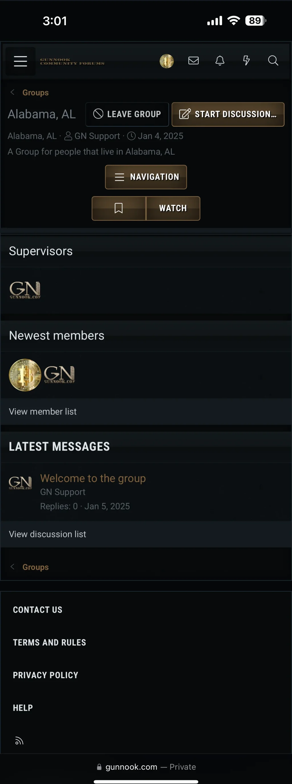
Because it's not really feasible to do so, without outright hiding the info block for mobile devices. XenForo has two forms of navigation; sidebar and sidenav. Sidebar is what you see in this thread; content to the right on desktop, and below on mobile. Sidenav is what you see in Social Groups; content to the left on desktop and above on mobile.Why would you not want to improve on the visual from the mobile side.
Thank you for suggesting this feature, it has now been implemented. We are aiming to include any changes that have been made in a future release (2.3.0).
Change log:
Change log:
Change: The group overview's "About" block is now hidden on mobile devices
Open
Change to
dbtech_social_groups_group_overview and find:
HTML:
            <div class="block-row block-row--separated">
                <h4 class="block-textHeader">{{ phrase('about') }}</h4>
HTML:
            <div class="block-row block-row--separated u-hideMedium">
<h4 class="block-textHeader">{{ phrase('about') }}</h4>Hello @l3gacy,
We hope your ticket regarding DragonByte Social Groups has been addressed to your satisfaction. This ticket has now been scheduled to be closed.
If your ticket has not been resolved, you can reply to this thread at any point in the next 7 days in order to reopen the ticket, afterwards this thread will be closed.
Please do not reply to this thread if your ticket has been resolved.
Thank you.
- DragonByte Technologies, Ltd.
Similar threads
- Support ticket
- Replies
- 6
- Views
- 2K
- Replies
- 3
- Views
- 617
- Replies
- 2
- Views
- 126
- Support ticket
- Replies
- 4
- Views
- 255
- Replies
- 2
- Views
- 183
DragonByte Social Groups
XenForo 2.2.x
XenForo 2.3.x
- Seller
- DragonByte Technologies
- Release date
- Last update
- Total downloads
- 369
- Customer rating
- 0.00 star(s) 0 ratings


